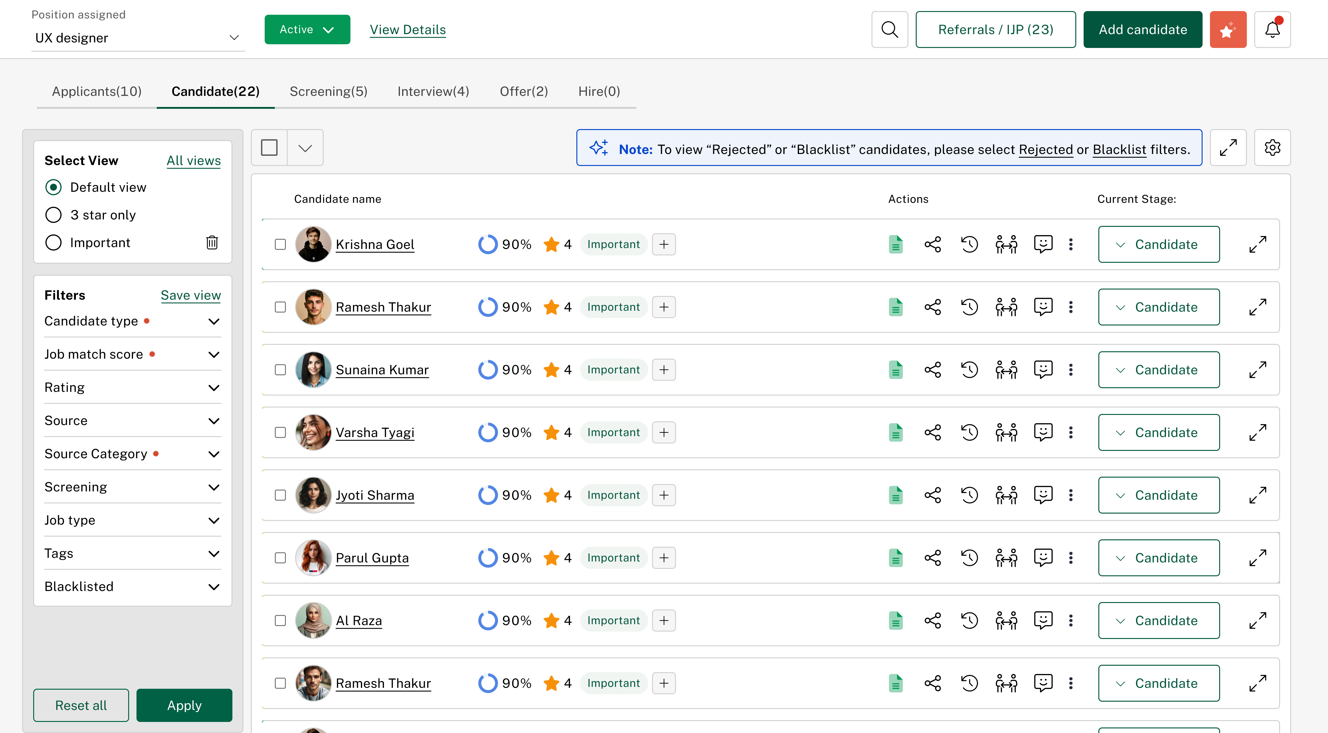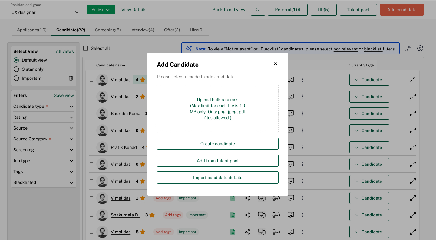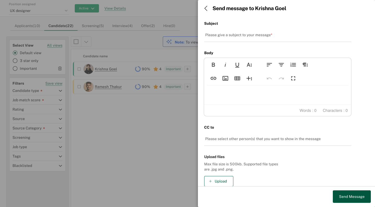
New recruiters screen


We brainstormed on the existing problems, regularly met the stakeholders and after the above empathise process we proceeded to define the problem as was presented to us :
We found some key insights which were common through the qualitative data :
- Very few candidate cards were visible on the first scroll
- Candidate details were static on each card irrespective of every stage and were not contextual
- Change stage popup was interfering with the page scroll and was not showing in one scroll
- Common filters across all stages
- in stage search functionality to look for a candidate
- No view for referred and IJP candidates
- Lack of hierarchy in actions on a candidate card
- Missing details of the job
- Lack of relevant sub-stages at different stages/lack of colour coding of those sub-stages
- Common search (candidate name, code, phone no.) functionality across all stages
- Option for the recruiter to take actions on the candidate card on the search flyer itself
- Referral / IJP button showing the candidates mapped respectively
- View details CTA to show the whole job opening details to the recruiter
- Introduction of dynamic sub-stages in each of the stages
- Presence of important actions on the candidate card
- Change stage popup made space friendly and easily accessible without scrolling
- Each candidate card details can be modified by the recruiter for their convenience
- Expanded / Collapse mode of the candidate cards for easy viewing
- Introduction of the applicant stage which includes candidates which are added in a particular position
- Introduction of relevancy score, notifications, AI (in progress)
and made design iterations starting from low-fidelity to hi-fidelity designs
The video below shows a glimpse of the redesigned recruiter’s screen in the HRMS :
Old problems, new solutions..
The journey started with repeated queries from the customer support team and the ever-growing NFRs of the existing position assigned page of our recruitment module in the HRMS. Now this flow starts when a position is assigned to a recruiter.
The recruiter can add candidates to that position through
- Talent pool
- Uploading resumes
- Filling out candidate forms
- Career portal
- Add a candidate
- Change stages of a candidate
- Schedule an interview
- Add internal notes
- Send messages to candidates
- Send offer letter
- Hire
Now the existing position-assigned page had all the above functionalities but the flow was broken at several stages. We took extensive user interviews/focus groups to know what the recruiters felt like. So we started with the internal recruiters and also took feedback from recruiters outside our organisation.
Then parallelly we also looked at the performance of the module by analysing its numbers like adoption rate, sales, user queries, configuration gaps, infrastructure issues, new feature requests, and product integrations through our CMS portals and incorporated the quantitative feedback also in the design process.
Previous recruiters screen
The video below shows a glimpse of the existing recruiter’s screen in the HRMS
